
Tobias Abel, Paintings, Verein für aktuelle Kunst/Ruhrgebiet e.V., Oberhausen 2006
Non-representational art – or art that deals with itself – directs one’s gaze to its material appearance. Details that used to be naturally part of a painting – and therefore not worth mentioning – are now in focus of the ekphrasis. Modern art finds its topics at the margins and drifts to the edge of our perception. From the painterly abstractions of a given external reality, the concrete reality of the pictorial elements became color and form.
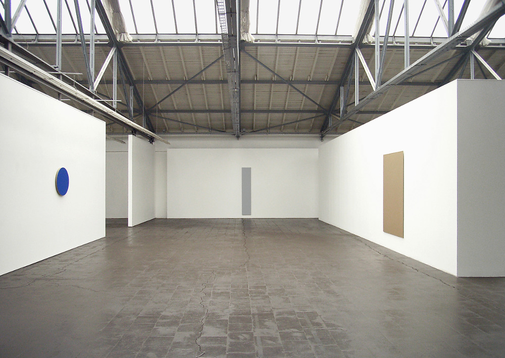
Seen in this way, as a point on a fictional scale of the history of the development of modern art, the monochrome gray, white or blue rectangles and circles of Tobias Abel appear as a conclusion, as a summary compression or – because Malevich’s black square is about to celebrate its centenary – as a postmodern quote. A track to Appropriation Art seems to have been laid, in which the aura of the heroic act is taken through a repetition or even copy of the original work of art. In fact, one can certainly say that compared to the works of Yves Klein, the monochrome in Tobias Abel’s work appears rather unauratic.
The paintings are even closer to conceptual art for another reason: the edges of the unframed works of Tobias Abel are unpainted, not even primed. Here, it becomes apparent that the support is linen, which is not recognizable on the almost coated rather than painted front side. Conversely, this means a radical reference to the two-dimensional picture plane. The viewer may well be energetically referred to his point of view, which is located in front of the painting. It is not about the physical aspect of the three-dimensional picture carrier, just as the painting itself dispenses with any gestural aspect; rather, the paintings are simply recognizable as painted.
The dichotomy of picture and picture carrier refers to the tradition of the panel painting and delimits the works of Tobias Abel from the expansive bodies of color of Gotthard Graubner, as they also differ by their manageable size of the color fields of abstract expressionists around Mark Rothko. Blue, gray and white rest on the back of a centuriesold history of painting. They need – and this is meant by the proximity to some works of conceptual art – the character of the panel painting to communicate their consistent formulation to the viewer.
The picture carrier or support is also important as far as the color, the painting style – and, we can conclude, the artist himself – behave respectively different on the varying support. Especially the works on paper significantly differ from the panel paintings. They are not consistently monochrome, and if so, there are chromatic gradations. Above all, compared to the extremely reduced gestures of the paintings, the brushstroke is almost present in the manner of an impasto.
If we call the pictures panel paintings, the works on paper are in the terms of classical art in the field of drawing. It is the artist’s most intimate method of study and expression, which already contains his ideas in their entirety but does not have to be finished or completed. The intimacy of these works on paper can also be traced back to another track in the European art history. Their presentation between two panes of glass not only reinforces their extremely fragile material character, it also recalls the presentation of disassembled pages of illuminated medieval manuscripts.
Their greatest treasure – despite many ornamentation and ever more realistic details – is the colors themselves, especially the golden and blue backgrounds that distracted the mostly wealthy owner from the religious texts and directed him to an idle meditative contemplation. The preciousness and fragility of the color itself has its place in the intimate works on paper, the singularity of the color is realized in the panel painting and its spatial effect.
From the earliest times of panel painting, contracts have been handed down, whereby the client has determined how much of each color should be used by the artist in the artwork to be made, as well as where it has to be placed. Tobias Abel’s works on linen and aluminum or copper sheets each have only one single color whose application is identical to the picture plane, so that there is no composition. Therefore, the artistic decision is to assign a particular larger or smaller plane to the corresponding color or – conversely – finding the appropriate appearing color for the predetermined plane by the prefabricated picture carrier. However, the colors of the works exhibited here hardly reveal any preferences or a programmatic use of a certain part of the visible spectrum. Apart from the blue circle, we search in vain for the pure and bright colors of concrete art. One of the paintings is even brown, which one can call the most unmodern of all colors, considering that the immersing into warm shades of golden brown – from the students of Rembrandt up to today’s history films – will make pictures aged and nostalgic.
Gray as an indifferent color was also used by Mondrian. It also represents the neutral and cool color of a continuous modernity in steel, glass and concrete, as well as being used in the field of automotive coating with metallic effects. Brown as the color of the earth and in painting the color of an illusionistic concept of reality already seemed reactionary in the times of the Impressionists and at least since the blood-and-soil ideology completely done. In the statement from the information media to this exhibition, Tobias Abel says that it is important for him to create works that are free from dogma and formalism, whereby the use of the color brown can be an indication of what he means by this statement. Attempts to understand the color in an associative way seem inappropriate.
At least we conclude that despite all possible references to the history of art and the emblematic character, the works say nothing except the unutterable. In their clear primary form and color, which either dominates the surrounding space or at least shows that white is not simply white, they claim for themselves the freedom to be in this way and not in any other. Thus, any arbitrariness is counterposed by the irreplaceability of the painting.
Text: Thomas Warnecke
Untitled, 2006 (gold), acrylic on aluminum, 180 x 120 cm
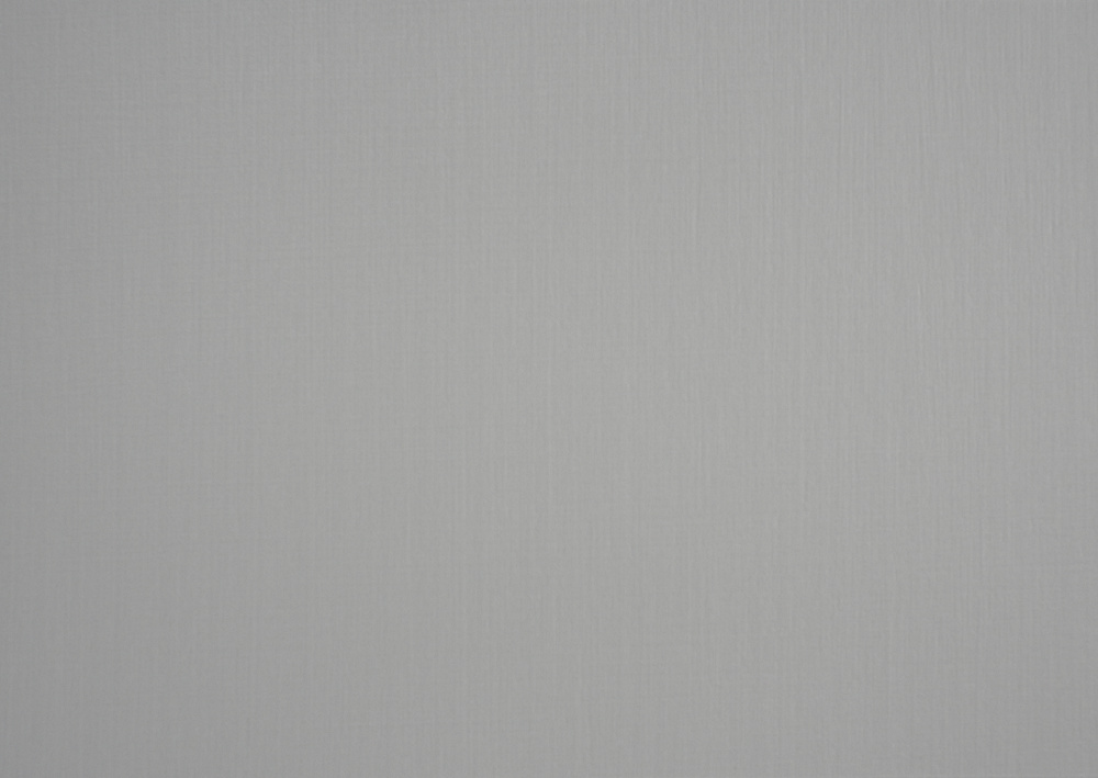
Untitled, 2004–06 (gray metallic), acrylic on linen, 101 x 74 cm
Untitled, 2004–05 (blue), acrylic on linen, diameter 60 cm, collection of Johann Widauer
Untitled, 2006 (gray metallic), acrylic on linen, 210 x 40 cm, collection of Johann Widauer
Untitled, 2006 (white), acrylic on linen, diameter 100 cm, private collection
Untitled, 2001 (black), acrylic on linen, diameter 34 cm
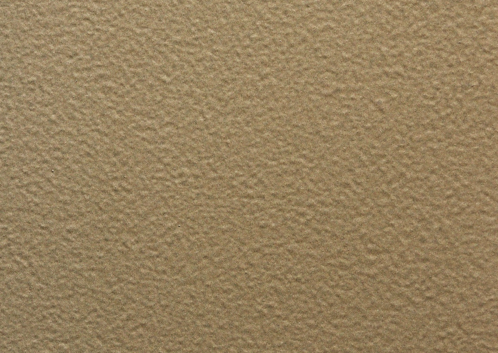
Untitled, 2006 (brown metallic), acrylic on linen, 60 x 50 cm, edition: 5, no.: 1/5, collection of Johann Widauer
Untitled, 2004–06 (white), acrylic on jute, diameter 34 cm, collection of Johann Widauer
Untitled, 2005 (dark gray metallic), acrylic on paper, 42 x 30 cm, framed 62 x 50 cm
Untitled, 2005 (dark gray metallic), acrylic on paper, 42 x 30 cm, framed 62 x 50 cm
Untitled, 2006 (brown metallic), acrylic on paper, 42 x 30 cm, framed 62 x 50 cm
Untitled, 2005 (green gold), acrylic on paper, 42 x 30 cm, framed 62 x 50 cm
Untitled, 2006 (light gray metallic), acrylic on paper, 42 x 30 cm, framed 62 x 50 cm
Untitled, 2005 (red metallic), acrylic on paper, 42 x 30 cm, framed 62 x 50 cm
Untitled, 2005–06 (gray metallic), acrylic on paper, 42 x 30 cm, framed 62 x 50 cm
Untitled, 2006 (gray metallic), acrylic on paper, 42 x 30 cm, framed 62 x 50 cm
Untitled, 2006 (light gray metallic), acrylic on paper, 42 x 30 cm, framed 62 x 50 cm, private collection
Untitled, 2005 (gold), acrylic on paper, 42 x 30 cm, framed 62 x 50 cm